
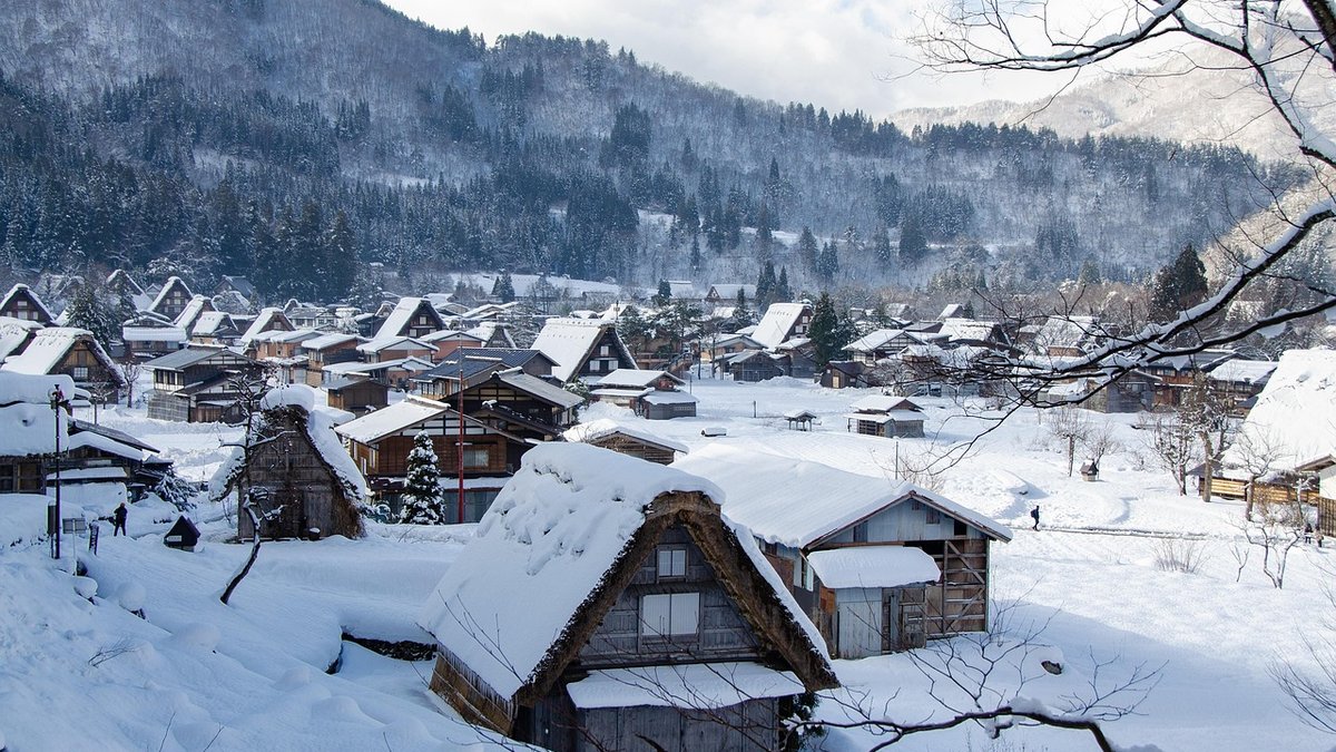
Before you open a single sample pot, spend a week watching how light moves through the room. Cottage rooms are rarely evenly lit. A north-facing parlour with one small window will feel cool and slightly grey for most of the day, while a south-facing kitchen with a low sill can be almost too bright by mid-afternoon. This matters more than any trend.
In north-facing rooms, cool greys, blue-greys and stark whites tend to go flat and slightly dingy. Warm off-whites, soft stone, pale ochre and gentle clay pinks hold their own instead. South-facing rooms are the opposite — sunlight is already warm, so colours with a yellow base can tip towards gold or even orange in late afternoon. Here, a cooler grey-green or a chalky taupe gives a calmer result.
Also note the size of your windows. A room with a window measuring under a metre square needs walls that reflect light back into the space. Mid-tone colours can work beautifully, but they will make a small, dark room feel smaller still. If you want depth, keep it for a room with two windows or a good east-facing aspect.
Traditional cottage colour schemes came from local materials — earth pigments, chalk, lime and linseed oil. That is why the palette feels so settled: ochre, umber, russet, sage, drab, stone and lime white all sit naturally against old brick, oak beams, flagstones and handmade tiles.
You do not need to copy a historic scheme exactly. A workable approach is to choose two or three related colours and let one of them do the heavy lifting:
Bear in mind that heritage colours often look stronger once applied than they do on a small card, because cottage rooms have less light bouncing around. If in doubt, choose one shade lighter than your instinct suggests.
A ceiling at 2.1 or 2.2 metres changes how colour behaves. White ceilings in a low room draw a hard line and make the walls feel shorter. Instead, take your wall colour up across the ceiling, or use the same tone in a slightly lighter mix. The eye stops noticing the join, and the room feels taller as a result.
For narrow rooms, painting the far end wall in a deeper shade can pull the space longer, but only if the side walls stay pale. Do not paint all four walls dark in a room this size — it will close in around you, especially in winter.
Beams deserve a mention. If they are dark oak, they already dominate. Painting the ceiling between them a warm off-white softens the contrast, whereas a bright white makes every beam look heavier. And if you have a dado rail or a picture rail, think twice before creating a strong horizontal band. In a low room, it chops the wall into slices. Either run the same colour above and below, or keep the difference very subtle.
Old walls need to breathe. If your cottage has lime plaster, solid brick or cob, sealing it with a standard vinyl matt emulsion traps moisture and eventually causes flaking, blistering and damp patches. Breathable options — limewash, clay paint and mineral paints — let vapour escape and are far more forgiving on uneven surfaces. They also have a soft, chalky depth that suits period rooms particularly well.
That said, modern finishes have their place. A washable matt emulsion is sensible in a boot room, a busy kitchen or a children's bedroom, where you will need to wipe marks off. Water-based eggshell on woodwork is hard-wearing, dries quickly and stays flexible as timber moves through the seasons. Use it on skirting, doors and window frames, and choose a slightly lower sheen than you would in a modern house — 20 to 30 per cent is usually enough to look smart without shouting.
One warning: never use a moisture-sealing paint on a wall with a known damp problem. Fix the cause first, then decorate.
Sample pots are worth the small cost. Paint two coats onto A2 or A1 pieces of lining paper or card — not directly onto the wall, where surrounding colours will confuse you. Move the boards around the room at different times of day and look at them against your flooring, curtains and any fixed furniture.
Preparation matters more in cottages than anywhere else. Fill cracks, sand back flaking areas, spot-prime bare timber and knots, and allow old plaster to dry out fully before painting. Expect two or three coats over a previous dark colour, and do not judge the finish until it is completely dry. A colour that looks disappointing at four o'clock may be exactly right by lamplight.

Hi, my name is Anthony kuber. I am artist and fashion designer.
I love to travel and writing blogging.
Your email address will not be published. Required fields are marked *
Software Developer & Writer
Hey, I'm Diva, a developer and writer blending code and creativity. I'm driven by a deep curiosity and a relentless pursuit of excellence. Join me as I craft digital solutions and captivating stories.


